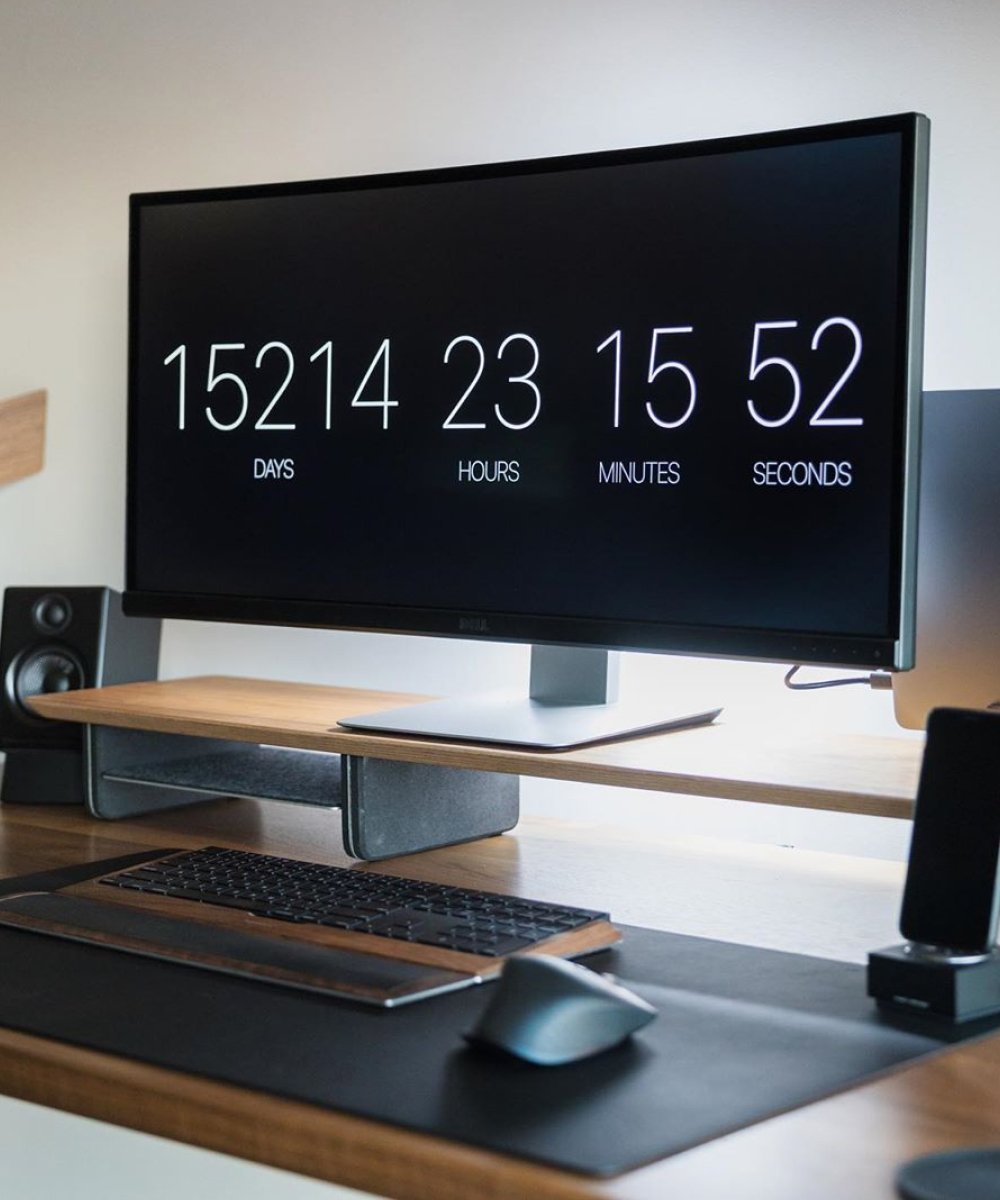
I wanted to create a space that was minimal and tailored around the needs of my work.
For the past 15 years, I’ve worked in various industries from advertising and branding, to education. Currently I’m the Chief Content Officer at The Futur, a design education company where I teach and share what I know through video content, thoughtful articles, interactive workshops, and speaking engagements.
I focus on the intersections of communication and the creative process so my time is usually split between doing two things: making content and managing the team.
So my workstation needed to be a space where I could be both a maker and a manager. Something that would allow me to do deep work and incorporate systems to help me focus on the most important day to day tasks.
Here’s how I did it.
To start the office design process, I blocked out the space in my favorite 3D program. (I know, super nerdy). This helped me figure out the general layout, before committing to any big efforts or purchases. I personally like dark minimal spaces, so I decided to paint two of my walls dark grey, which I color matched to the other areas of the building.
For my desk, I chose the Sway desk by Ergonifis. It’s a motorized sit stand desk that’s made of solid walnut and has black detailed finishes. It gives me a lot of real estate to work on and has programmable settings so I can lock in the optimal height for both sitting and standing.
For the rest of the space, I wanted to keep a consistent aesthetic, so I tried to match the rest of my accessories, to pair with the walnut wood of my desk and the dark paint on my walls.
I also created a “cozy corner”, to help me relax between sprints of work and add a little warmth to the space. This corner of my office is specially designed for decompression. A big comfy Barcelona chair, surrounded by beautiful green indoor plants. The round rug on the floor helps to visually anchor the open area, and the organic shape of the plants break up straight lines of the room.
To light my space, I was looking for a flexible system that would adjust as the day transitions into night. To accomplish this, I invested in a set of Phillips Hue Play lights to place behind my monitor, and a few bulbs for the lamps I had in the room. This gives me plenty of ambient lighting. Which I can adjust for cool temperatures during the day to help me focus. And can shift into warm temperatures at night, when I’m winding down.
There’s still a lot of empty space in the room for potential shelving or decorations, but for now, I thought I’d keep it minimal and live in the space a bit, before I add anything else (yet).
—–
Matthew Encina is the the Chief Content Officer at The Futur, a design education company. He also serves as a creative director at Blind, a design consultancy where he creates interactive experiences and content for brands, tech, and video games.
You can learn more about Matthew by visiting his Instagram @matthewencina & @mod.musings, YouTube channel @matthewencina, or by going to his website: matthewencina.com
